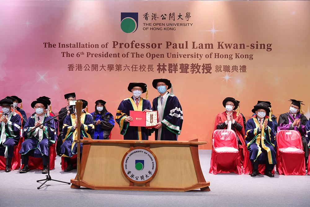
The University is turning a new page soon and will be retitled as Hong Kong Metropolitan University. With the new logo unveiled, do you know the meaning of the OUHK's current logo?
The design concept of the current logo is derived from the acronym 'OU' of the English name 'Open University’. The sun and the moon are two separate planets and they are assembled to form the logo. With the letter 'O' resembling the sun and the space between the two letters a crescent moon, the logo has a symbolic meaning of the flexibility of learning.
The logo also demonstrates a fine blend of the traditional Chinese calligraphy and modern western style, symbolizing the wide variety of programmes provided by the University. Moreover, the clear and concise strokes of the Chinese name of the University were the masterpiece of the famous Chinese calligrapher Mr Qi Kung.


